


Movie posters have been around about as long as the medium of film itself.
In that time, they’ve gone from being basic, obligatory marketing tools to works of art in their own right, with the very best able to convey the feel and tone of a movie with a simple, striking image, selling people on something they may not have originally been interested in.
But despite the important role posters can play in a movie’s marketing push, they’re not always given the time, care or attention that they deserve.
Even the biggest companies are guilty of phoning it in with their posters, with Marvel’s jam-packed Spider-Man: Homecoming one-sheet being endlessly mocked on Twitter and Fox’s X-Men: First Class producing a series of disgraceful character posters, but being lazy is one thing, and making an accidentally hilarious mistake is another.
From bad Photoshop skills to poor compositing and even missing imagery, the amount of errors that sneak their way onto official, studio-approved (presumably) movie posters is genuinely shocking.
On the plus side, these errors are quite funny. The poster artist probably isn’t laughing, but we definitely are…[/nextpage][nextpage]
10. Death At A Funeral (2010)
Having released in 2010, the American remake of the 2007 British comedy Death At A Funeral has got to be one of the quickest turnarounds for a remake ever.
This rushed time-frame evidently impacted the marketing department, who, in a serious anatomical error, forgot to provide James Marsden with a normal bodily component; his right nipple.
To be fair, they may have also forgotten his left nipple – being consistently bad is still being consistent, at least – but since it’s covered by Chris Rock’s arm, we’ll never know. One of the great unsolved movie-poster mysteries!
A plot point in the film involves Marsden’s character being given a hallucinogenic drug, which explains why the poster makes him look so thrilled to have a deformed body. Hell, he could be hallucinating three nipples. Or four.
Or, perhaps he looks so excited because Zoe Saldana’s left arm appears to be reaching down to grab a load of his… well, we’ll leave that to your imagination. Maybe the poster designer forgot to give him one of those, too.
Or, perhaps he looks so excited because Zoe Saldana’s left arm appears to be reaching down to grab a load of his… well, we’ll leave that to your imagination. Maybe the poster designer forgot to give him one of those, too.

[/nextpage][nextpage]
9. Highlander: Endgame (2000)
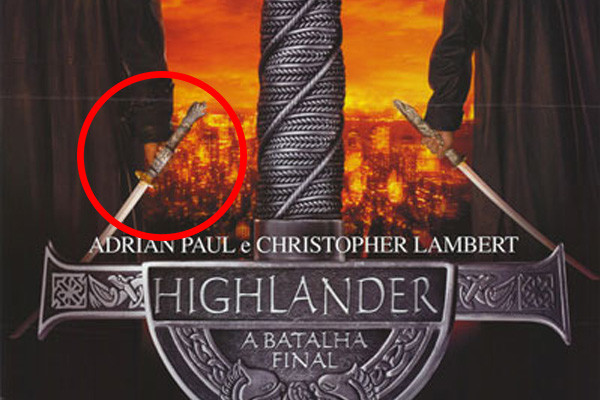
This mistake appeared on both the Portuguese and English-language versions of the Highlander: Endgame poster, making it even more unbelievable that nobody spotted it before it got sent out.
The movie itself involves several fantastical elements so some weirdness could be excused, but what can’t be excused is the fact that Christopher Lambert’s sword appears to be floating in the air by itself.
If you look closely you can see that his fist is closed so he was supposed to be holding the weapon, it’s just that the poster designer layered it over the top of the hand instead of behind the fingers.
Even worse is the fact that Adrian Paul’s sword is behaving perfectly normally! How can you do it right on one side, yet completely screw it up on the other? Maybe there was a secret vendetta against Christopher Lambert? Or is this the magic sword that chopped off Marsden’s nipple? So many questions.
[/nextpage][nextpage]
8. Nine (2009)
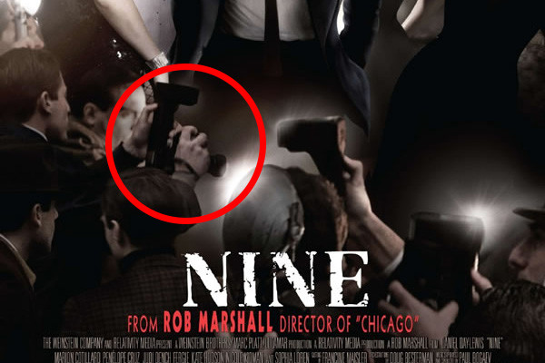
One of the most important rules of movie poster design is don’t ignore the details.
Sure, it’s the imagery that’s front and centre that draws the eye the most, but don’t ignore the stuff in the corner, or at the bottom, because people will find anything lazy that’s hidden there. That’s what the Internet is for.
Take the poster for Nine, a 2009 romantic drama starring the great Daniel Day-Lewis. On the surface, everything looks spot on; the actors have all been airbrushed to death, but that’s nothing out of the ordinary.
And then, you look at the paparazzi at the bottom – specifically, the chap on the left who’s holding a camera, and appears to be taking a shot of Day-Lewis’… crotch? His knee? His thigh? Who knows.
And take a look at the camera in the middle, that’s taking a shot of the guy taking a shot of Day-Lewis’ lower-regions. Shouldn’t they all be getting a good shot of his face, or his entire top-half? What on Earth is going on?
If Daniel Day-Lewis walked in the room we’d all definitely take a snap, but we’d aim the camera a bit more skillfully than these blokes seem to be doing.

[/nextpage][nextpage]
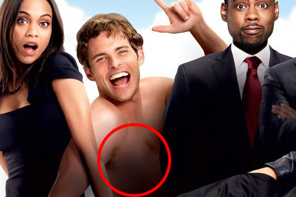
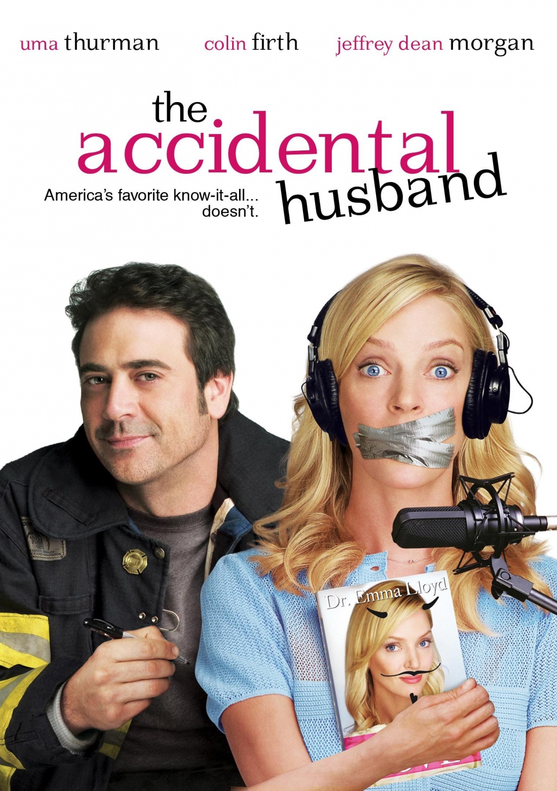
7. The Accidental Husband (2008)
Pretty much every single poster for The Accidental Husband was poorly put together (including one that showed Uma Thurman plummeting to her death with Colin Firth and Jeffrey Dean Morgan standing nearby), but this one definitely takes the cake.
It’s not that Jeffrey Dean Morgan’s eyes look weird, or that he looks like a discount Javier Bardem – it’s that arm. That arm right at the bottom. That arm that looks like it belongs to Uma Thurman (the nails, skin tone and lack of hair all make it look like a female appendage) but couldn’t possibly do so, given the angle at which it enters the frame.
Given the positioning of the two arms attached to her body, it would literally be impossible for one of them to bend in this way without Thurman being possessed by some evil, body-contorting demon, and even then it would be a stretch.
Quite how the poster designer thought they could get away with putting a random arm at the bottom of the frame isn’t clear, but what is clear is that they failed miserably.
(Excerpt) Read More at: WhatCulture.com[/nextpage]